Hey
guys,for todays post im going to be evualting past students work.
Below is a short evaluation of some of the past student footage and how it
effects me when I will be creating my own production.
Suffocation

Now I’m going to start analysing
some of the student’s work. The first one that I’m going to evaluate is
“suffocation”. They presented their credits really well also there
graphics worked really well, the storyline was very clear in addition they had
a good range of shots for examples close ups and mid shots. The weakness of
their work has to be the main character clothing which does not relate to the
situation they are in.

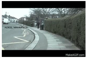
The gif
denotes a guy who is stressing out over his work with a text transition below; this
connotes one of the conventions of institutional credits. I really like how
they present the text in a diagonal position laid on the books. The text lasts
for about 4 seconds on screen which is
perfect as the audience can clearly read what the text is saying.


The jump cut was absolutely perfect as there was no disruptions on screens .This was one my favourite bits of the whole footage because as an audience it will be boring for the guy to walk for a long time but with the jump cut it shows that timing is running out for him to go home.

I
really liked how they portrayed depression as it is denoted in this shot of a girl holding wine, the picture connotes her drinking problem which highlighted
through the title suffocation as she is suffering from drinking. Thye audience
might not find this clear as it was obvious in the class how people got
confussed on this shot, to improve this shot they should of put some dialogue
relating to her problem.
I gave this a mark out of 49 which is a level 4 as the material is appropriate for the target audience and task also the titles were used appropriately according to institutional conventions.
Bridges (weak)

The sound one which I’m going to evaluate is “bridges”. With this one I had many weaknesses the fact that there was no clear narrative, the 180 degree rule was broken when they filmed there shots and also the credit and title on the screen went off to quickly, this was very poor as the audience will not know what the credit or title is saying. The music also stopped half way, this was very random which made the footage awkward towards the end.

The titles went off to quickly and you cannot see it well so i think they should of made the text black and bold so the audience could see the text
I would say one of the strengths is
the typography for bridges as it fits the genre of their piece.The typography almost symbolize indian culte as they use this type of writing in asian culture.

The continuity
work is awful at first his hands are up
in the air and then all a sudden his hand are in his pockets this was very
poor however i would say that the choice of mid-shot was a good choice as you
could see their hands.

I gave this a level 2 and the mark 24 because I thought that the titles are appropriately according to institutional conventions and that the shooting material is appropriate to the task set which includes the use of camera and attention to framing ,the Varity of shots and close attention to Mise-en-scene.
The actual mark given to Bridges: 29
Other past students work
Maze

Maze had a really good music but I would say that the music was too upbeat so it didn’t fit the footage well. They had a good range of shots for example close-up and long shots. The theme fitted really well to social realism and also the Mise-en-scene looked really good as well. The story line was very clear also the music was hinting out some of the story of the footage which therefore worked really well.i gave this one out of level 54 as it was very interesting and diverted to other past students footage.
The actual mark given to Maze: 56
Damaged
goods

The different shots worked really
well thought the footage also the typical slutty character worked suited well
to her character, very clear narrative was portrayed thought footage. The
credits and tile worked very well and it was positioned on the right timings
.Lovely range of shots. The one weakness which was present throughout the
footage has to be the lighting, the footage was to dark so I couldn’t see what
actions the character is trying to convey. I gave this a mark out of 56 which
is a level 4.The reason why I choose this is because the titles and editing
worked really well and it was appropriate to the target audience.

The actual mark given to damaged goods: 56
Southpaw

There was no dialogue which fits
perfectly well for British films as they dont have that much talking at the
beginning of the two minute footage. The music was very upbeat and also very
gangsterly very good location. Locations
are usually set in very poor and deprived areas, but most of all everyday
places which anybody may come across in there day to day life. Locations are
filmed in actual real places, which are different from most genres, which are
mainly shot in studio/staged areas. The reasoning behind filming in these
everyday areas makes the film seem truer to real life and more relatable to the
viewer. This why i really liked the choice of location.
The actual mark given to south paw:
56


Drained

Overall
I would say drained was my favourite opening out of all of them, the shots of
there camera work was fantastic. I really like the range of camera shots for
example the two shot of them talking to each other. The music and dialogue fitted
the theme and also the titles came on the right timing and good choice of
typography. However I would say the weakness of this movie was that the story
line was unclear at times and the acting was quite forced which made is quite
funny to watch and as an audience we dont want to see that.
The actual mark given to Drained: 58
Fast life
Fast
life I found was really good as it had clear characters which are typical in British
social realism and their typography suited the genre however I thought that the
music was too loud, they just need to lower the music, and the transitions of
the titles went off to fast which is hard for the audience to read.
The actual mark given to Fast life: 32
No comments:
Post a Comment